

My role
I was the art director and designer responsible for Vitra’s visual identity and newsletter design. I also directed motion and 3D designers in the craft of animations across the brand ecosystem.
Project information
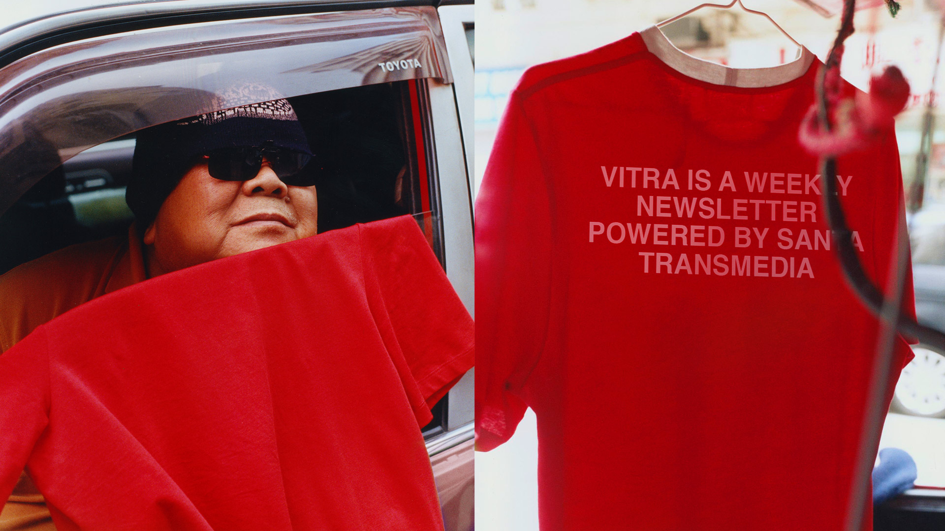
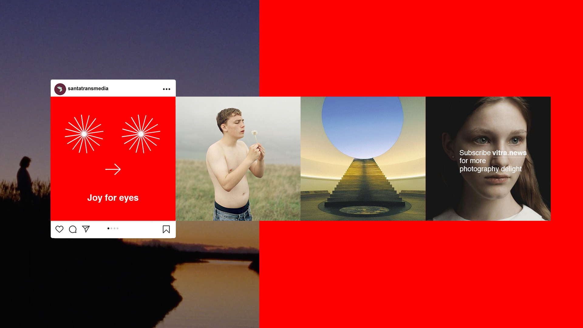
Vitra was conceived as a weekly newsletter designed to fuel the artistic and creative community through a sharp curation of film, photography and art. Created by Santa Transmedia, the intention was to build a space where the content truly led, functioning almost like a never-ending moodboard that any creative would want within arm’s reach.
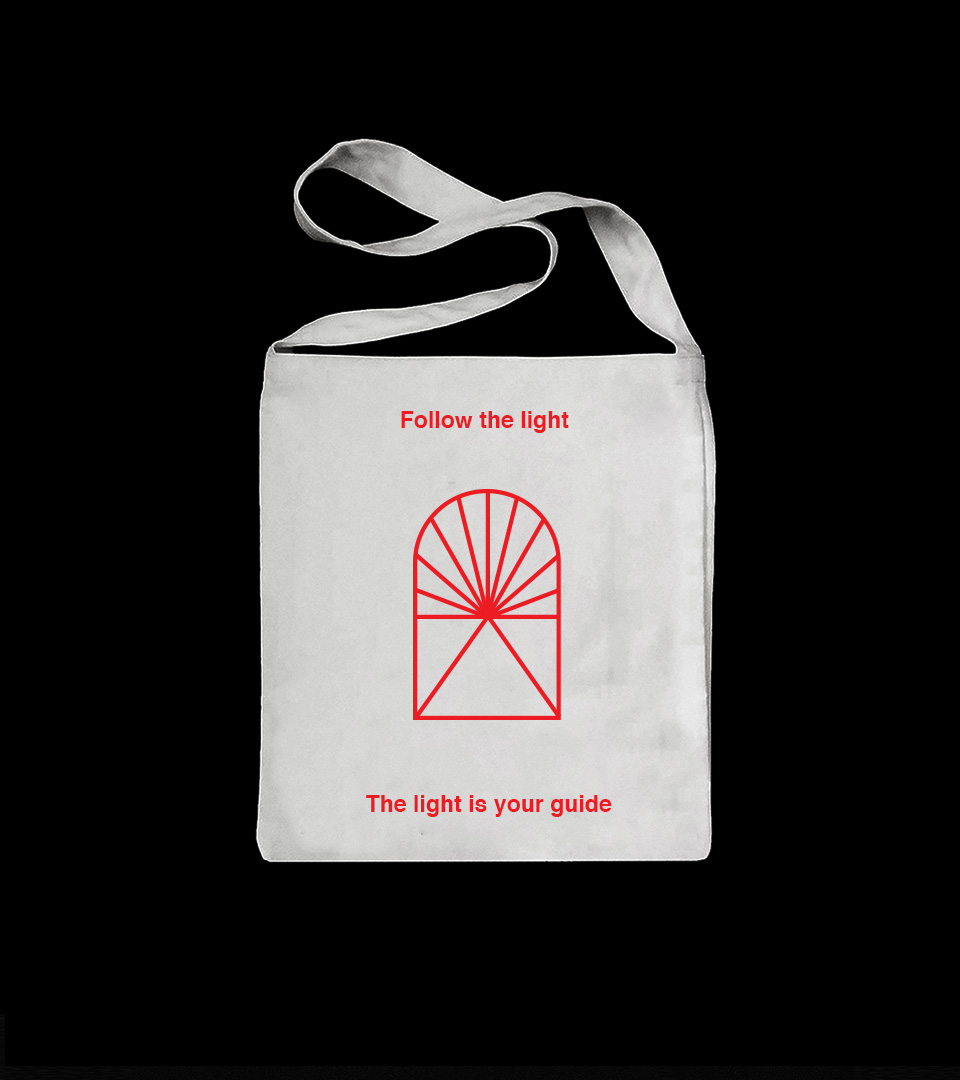
To bring this vision to life, we developed a brand identity that was intentionally clean while still carrying enough visual attitude to feel relevant and contemporary. Vibrant red became the signature color, paired with minimalistic layouts, Helvetica typography and a carefully curated selection of imagery chosen to spark ideas at a glance. The logo took inspiration from stained-glass windows and was designed as a symbolic point of light, a portal for new perceptions. Its structure references the harmony of the Vitruvian Man, giving the brand a sense of balance and quiet sacredness that resonates across every touchpoint.
As the project took off, Vitra quickly grew into a broader creative ecosystem. The newsletter surpassed 200 editions and expanded into a dedicated website that gathers every issue into a living, searchable archive of inspiration. The platform also made its way to Instagram, extending Vitra’s visual universe and bringing its curated content to an even wider audience. More than 300 people signed up to receive the newsletter, helping the project build a tight and engaged creative community around its weekly drops.
Credits
Creative Direction: Filipe Zapelini
Motion Design: Nathan Ezahya
3D: Camilla Baratucci
Year
2021