


My role
I was essentially a one-man band on this pro-bono project, co-leading creative direction, leading art direction, motion design, design, and copywriting.
Project information
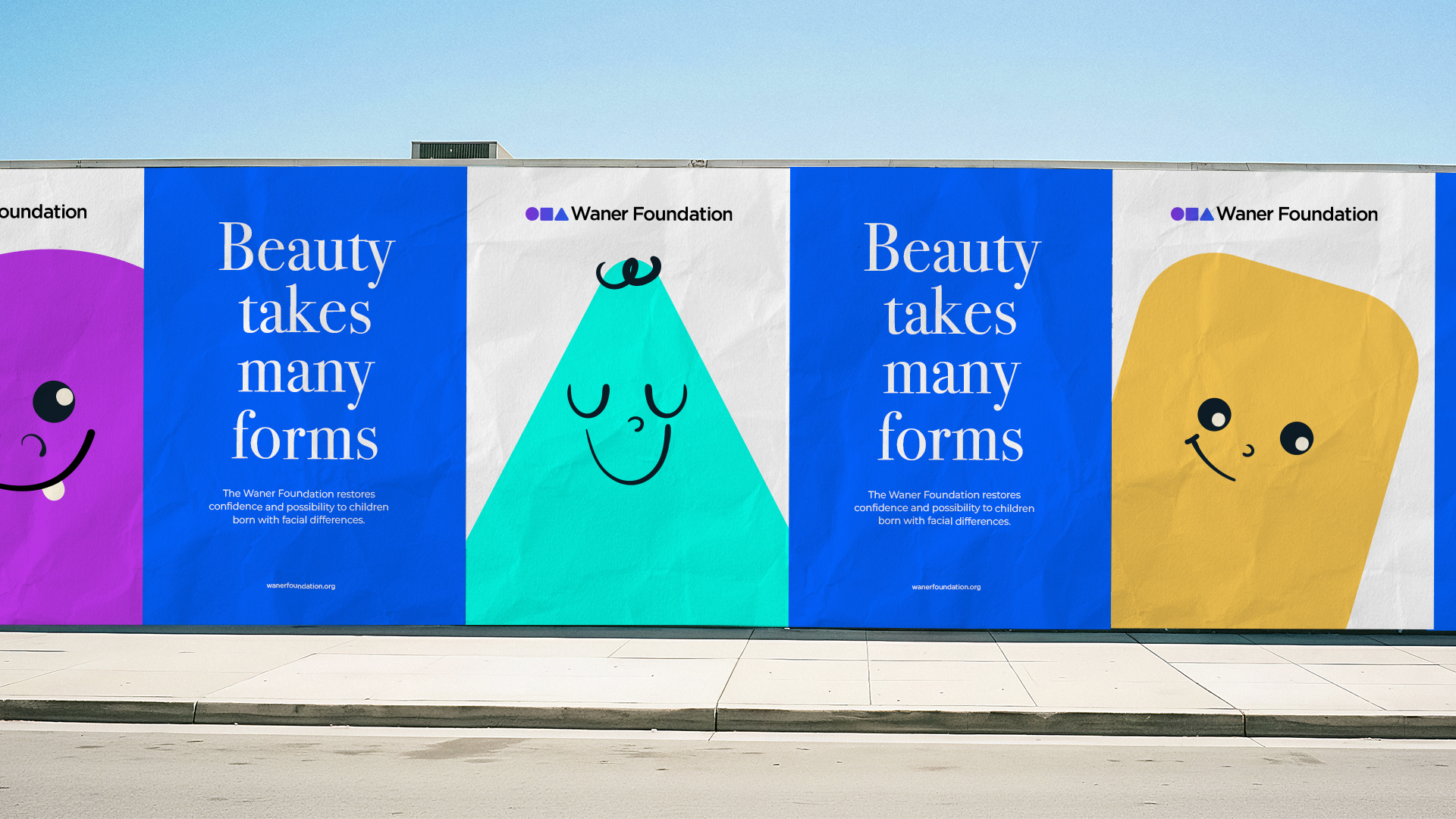
Waner Foundation set out to refresh its brand and launch a new campaign that could communicate its mission with more warmth and clarity. The challenge was to move beyond clinical narratives and reposition the foundation as a compassionate, approachable voice that celebrates individuality while supporting children with facial differences.
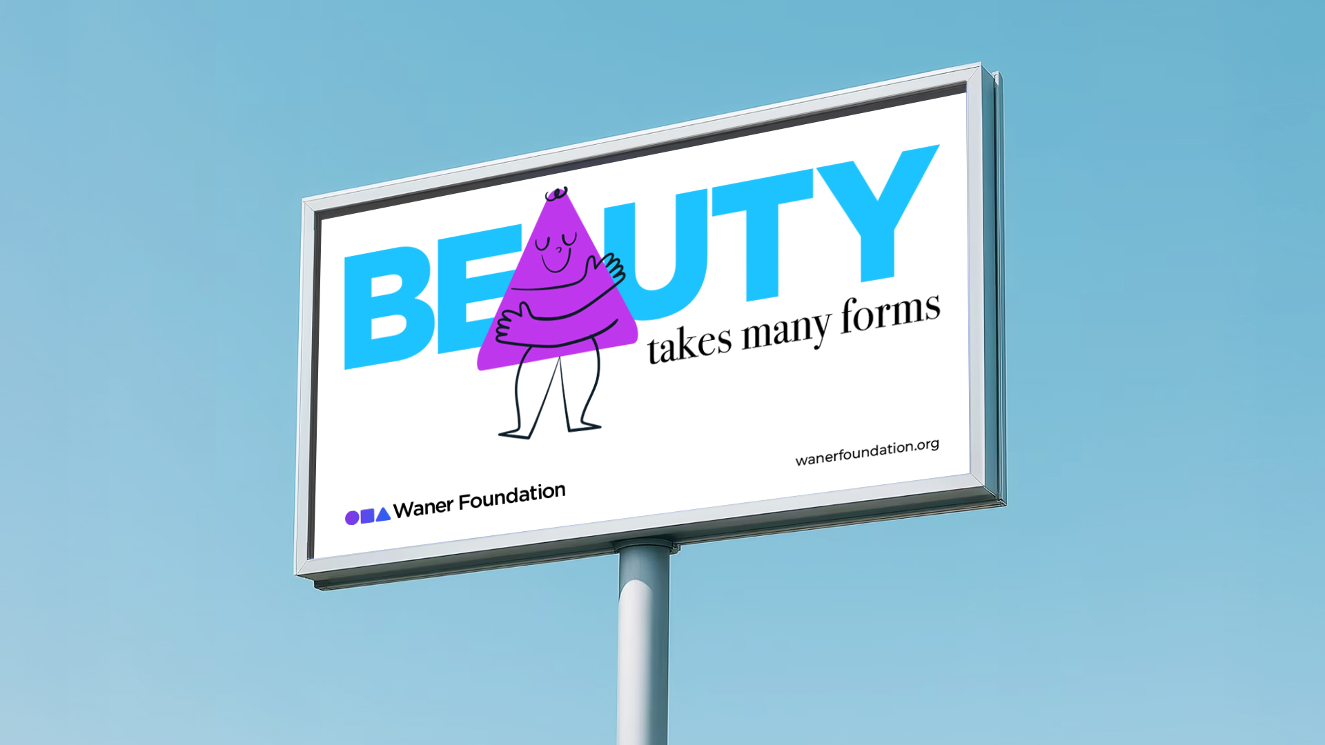
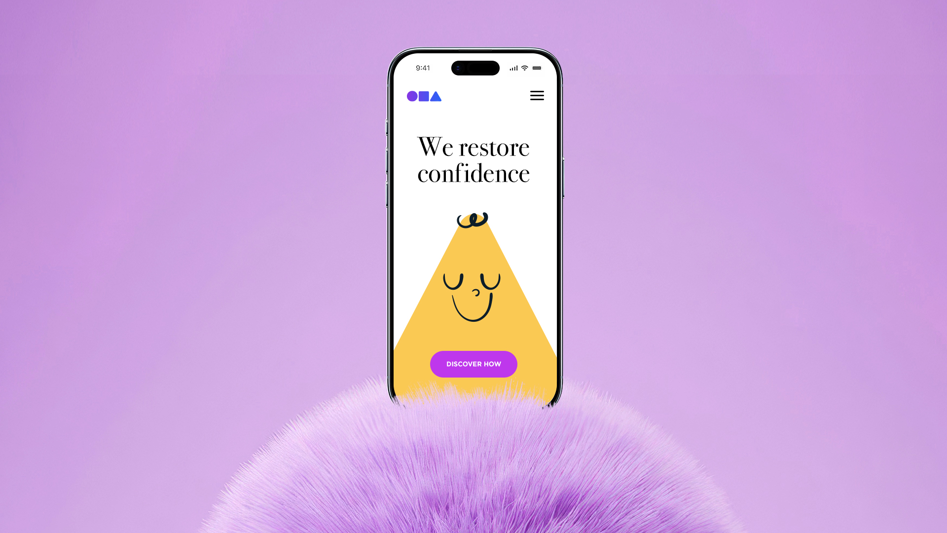
The campaign concept, Beauty Takes Many Forms, was built around a simple but powerful truth: every person is unique, with their own character and a beauty that is entirely their own. Through each individual journey, what is felt on the inside can finally be seen on the outside, revealed in its most honest and authentic form. This idea became the emotional backbone of the campaign, guiding both the visual language and the tone of voice across all touchpoints.
The logo redesign played a key role in expressing this shift. The three geometric shapes were refined with rounded edges and a subtle gradient to soften the system and better integrate with the typography. Their spacing was adjusted to create a tighter, more unified symbol, while careful kerning improvements brought balance to the logotype. Lowercase lettering reinforced the brand’s geometric foundation while giving it a warmer, more approachable presence.
To push the creative potential and elevate the campaign, I used AI as a creative and exploratory tool to develop a full photographic shoot and video assets for Beauty Takes Many Forms, as well as detailed mockups across digital, social, and OOH. Motion design was also a central component of the work. Using Jitter, I created animations with a light, friendly, and optimistic tone. Soft transitions and gentle pacing helped reinforce the foundation’s caring personality, balancing emotional storytelling with approachability.
The result was a cohesive brand redesign and campaign platform that gave Waner Foundation a stronger emotional voice and a more contemporary presence. Beauty Takes Many Forms became a clear and flexible narrative system, helping the organization connect more deeply with families, children, and the broader community.
Credits
Agency: The Perception
Principal: Brian Anderson
Associate Creative Director: Jojo Bringuier
Year
2025