My role
I was the creative director, art director and designer responsible for developing the brand's global campaign.
Project information
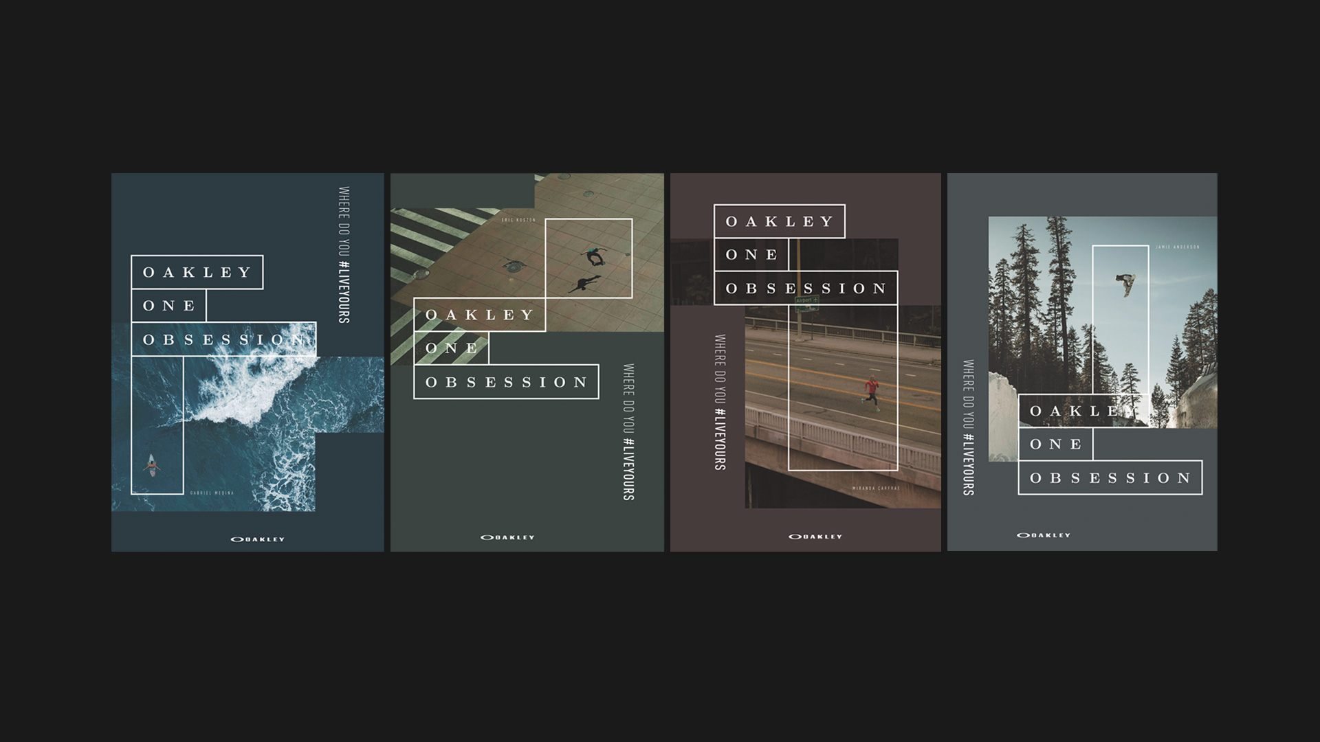
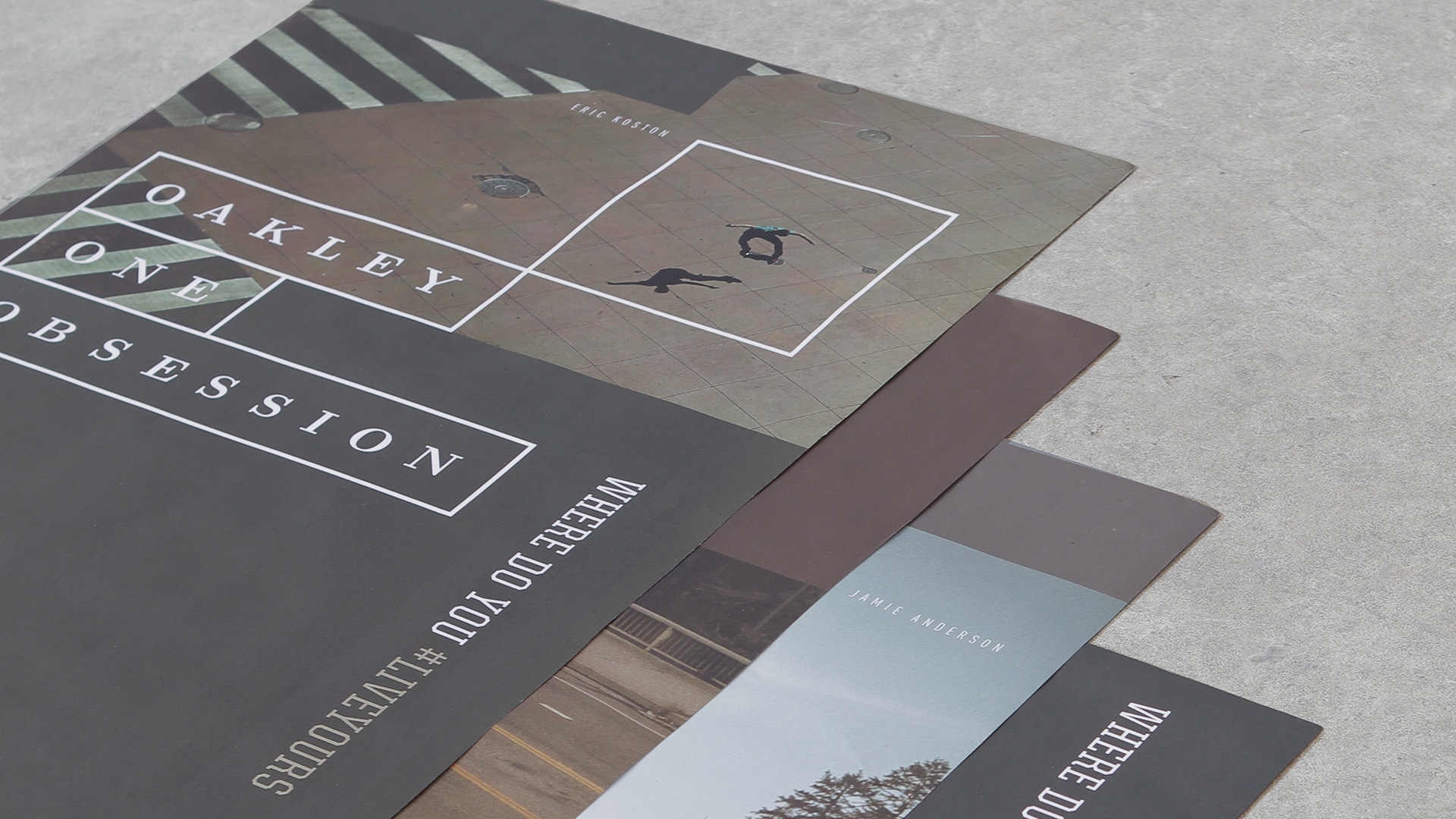
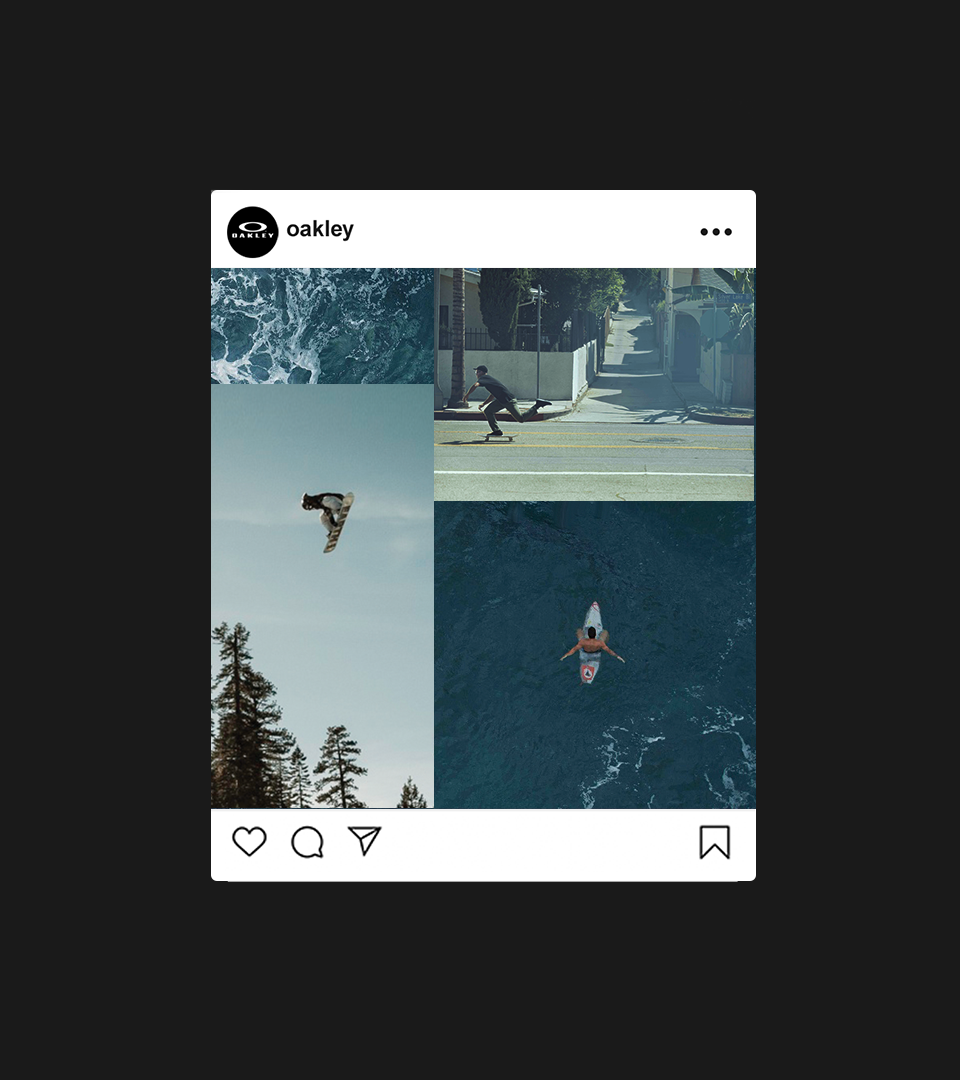
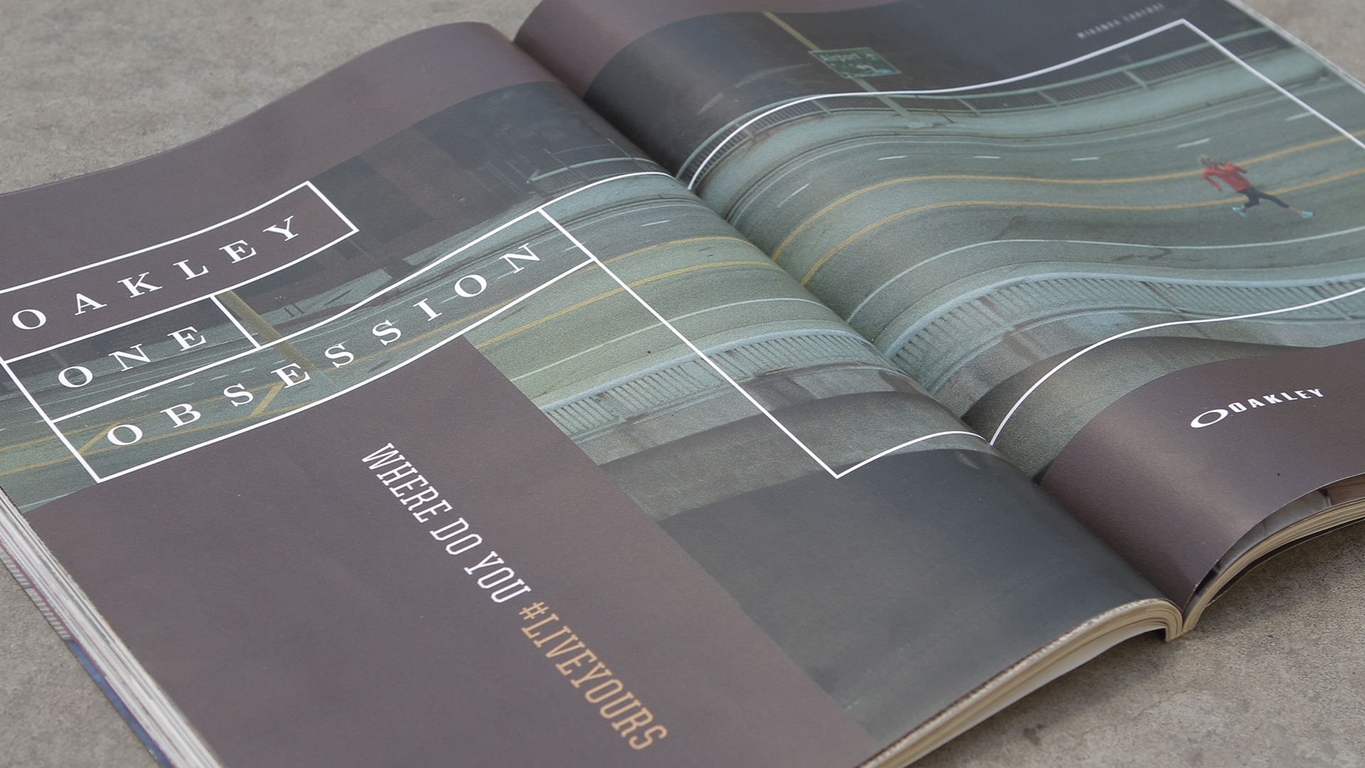
Oakley’s global campaign One Obsession set out to explore the emotional connection between athletes and the spaces they claim as their personal training grounds. This project was developed as a proposal for the brand’s global rollout, aiming to expand the campaign’s creative territory with a fresh visual approach. Partnering with the production house Goma, my challenge was to create an art direction and visual identity system that could capture this mindset with the kind of clarity and attitude expected from a brand that lives at the intersection of sport, culture and performance.
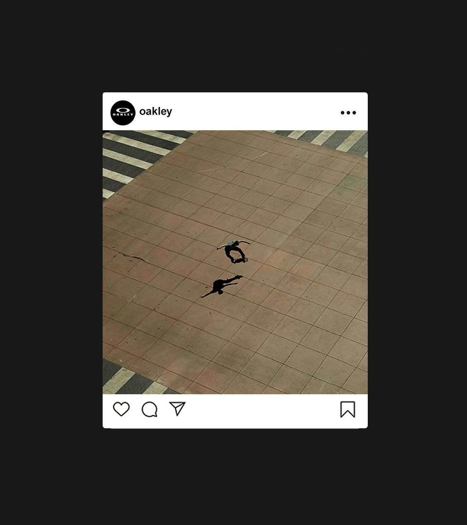
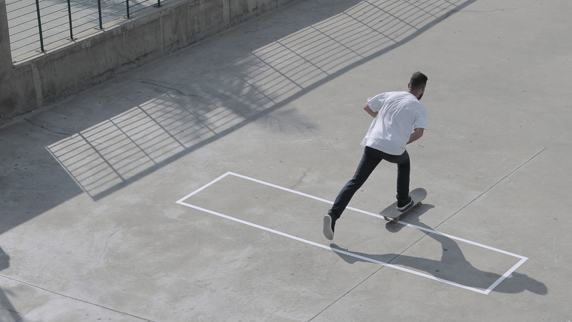
The visual identity centered around a simple rectangle that symbolized the athlete’s focus zone. It represented the frame through which each individual sees their craft, the mental tunnel vision that pushes them to go further and sharpen their skills day after day. From that single shape, I created a modular system that expanded, stretched and multiplied, allowing the layouts to feel both structured and dynamic. This flexible language helped the campaign live comfortably across print, outdoor, film and social, always carrying the same visual rhythm.
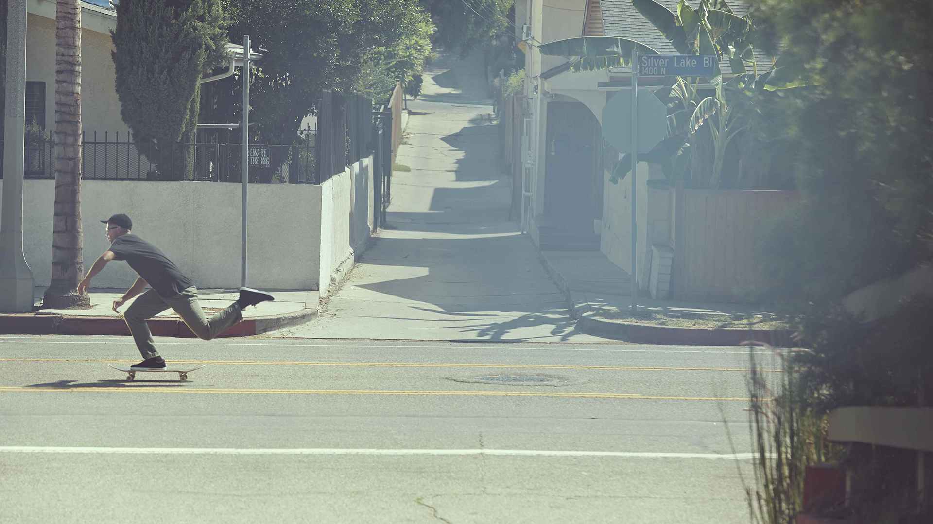
To reinforce the concept, the rectangle evolved into a physical installation that marked the athletes’ training spaces, transforming the graphic element into a real-world point of interaction with the community. By placing this form directly onto concrete, courts and other practice environments, the campaign bridged the gap between visual identity and lived experience, making the concept tangible and culturally relevant.
The result was a visual universe that connected Oakley’s performance-driven ethos with a contemporary graphic voice. It created a strong narrative device that encouraged athletes and fans to reflect on their own obsessions and the spaces that shape them. Across every execution, the campaign materials carried a unified look and feel that was bold, clean and unmistakably Oakley.
Credits
Production company: Goma
Creative, Art Direction and Design: Felipe Guimarães
Case study photography: André Bernardes
Year
2015