My role
I led the creative direction, motion design direction, art direction, and design for The Shark’s visual brand expression and visual.
Project information
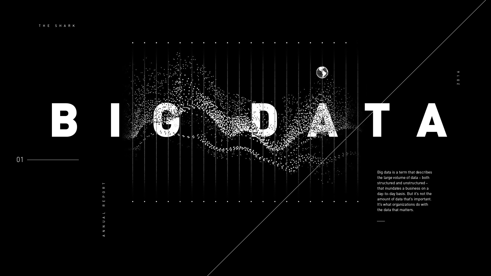
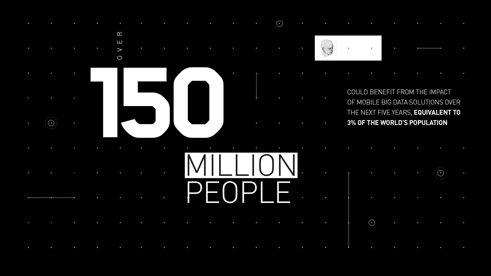
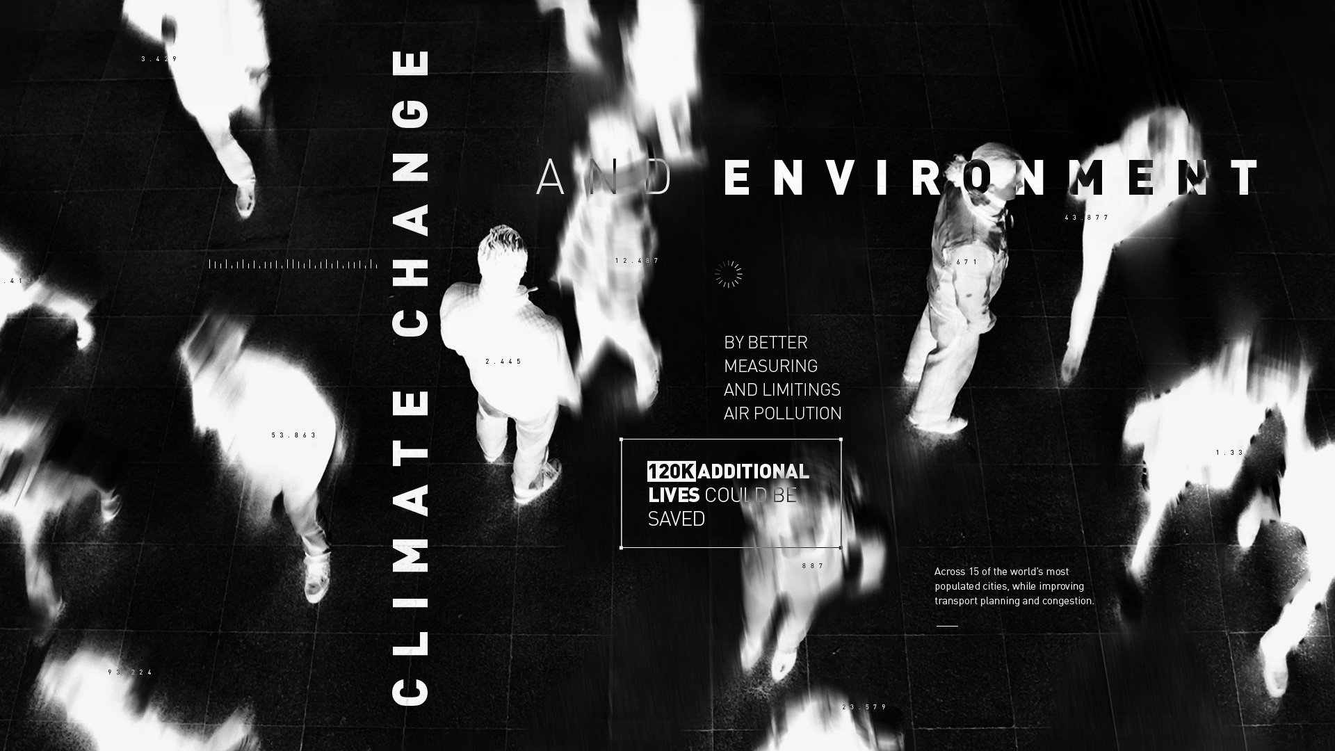
The Shark is a tech driven company that blends innovation, data intelligence and user centered thinking to create solutions that genuinely improve people’s lives. The brief called for a visual identity that could translate this mix of precision and purpose into a striking brand language that feels both contemporary and future ready.
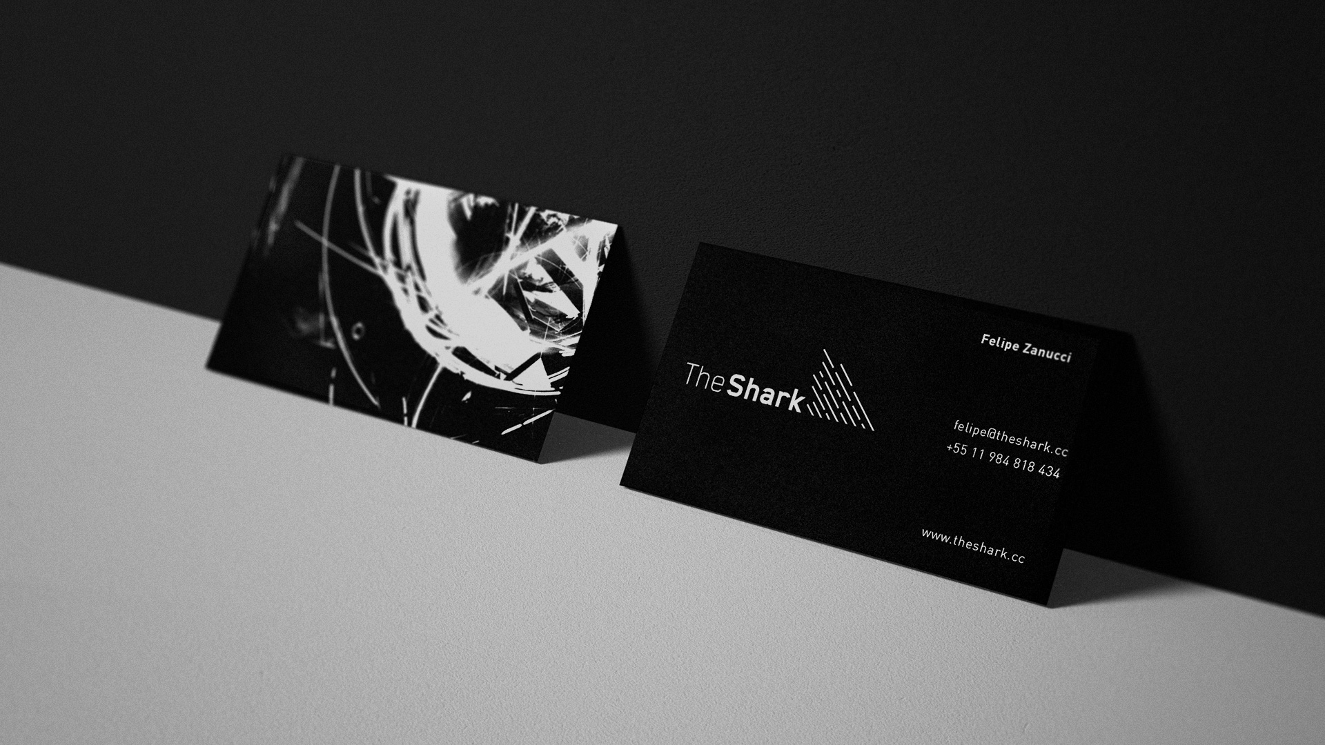
We started by breaking down the anatomy of a shark to understand what makes it iconic. The fin stood out as a symbol of direction, stability and instinct. It became the cornerstone of the identity. Through a system of diagonal lines with different lengths, we created a graphic fin that suggests movement, sharp thinking and a brand constantly cutting through the noise. This symbol is paired with a geometric logotype that reinforces a clean and high tech aesthetic, positioning The Shark as a company built on clarity and forward motion.
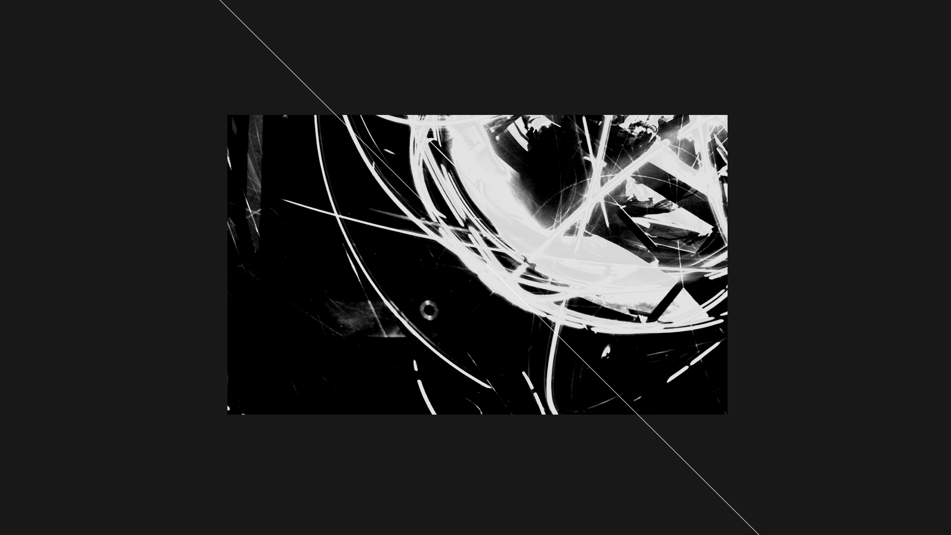
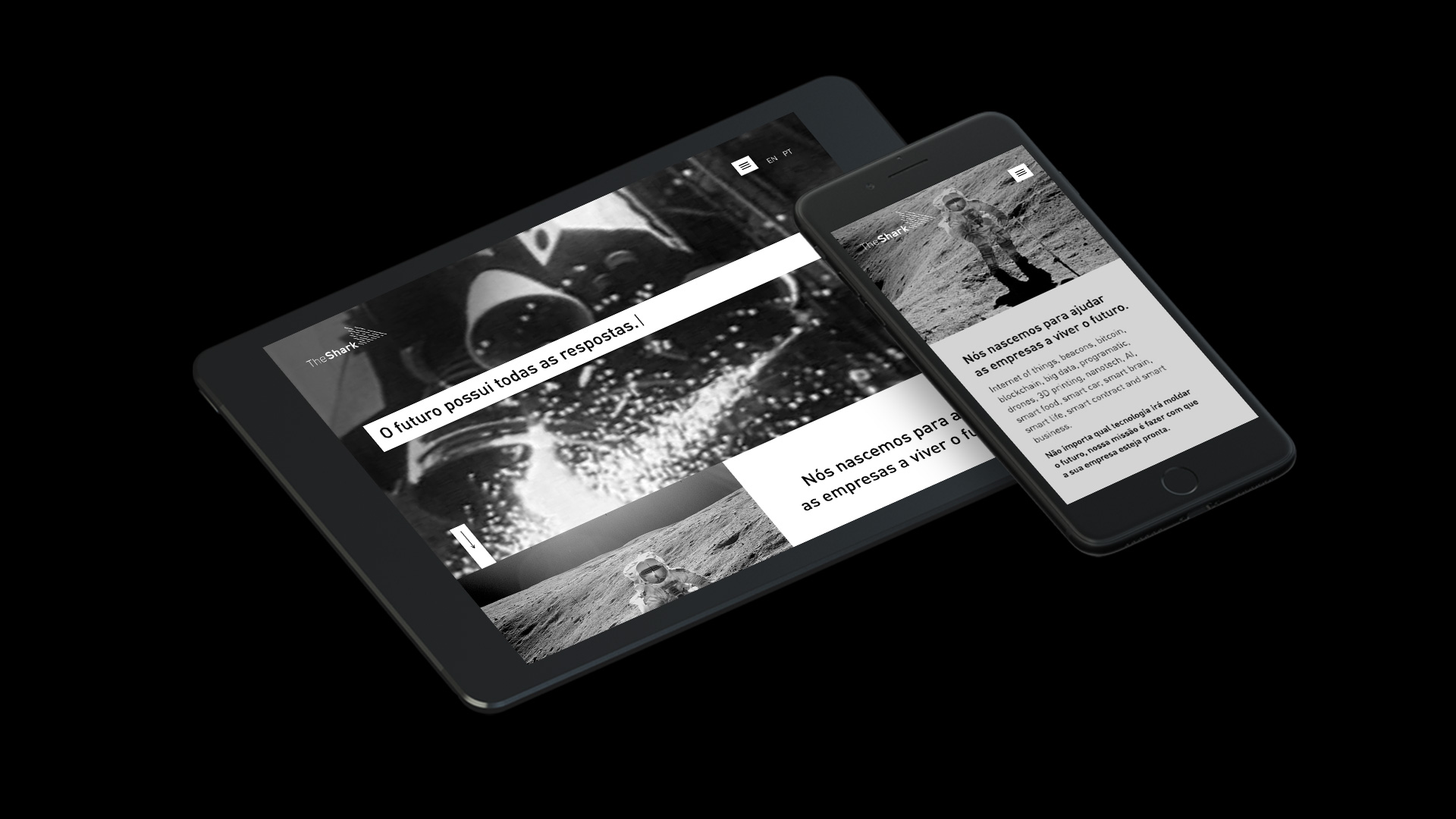
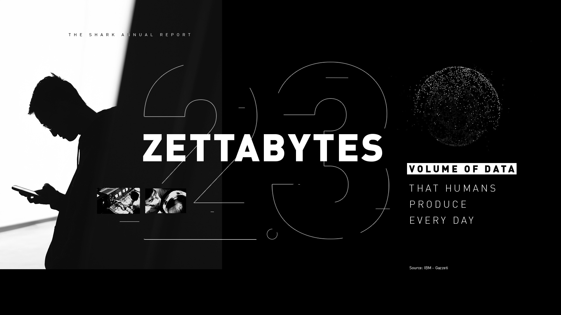
To push the narrative further and add cultural weight to the visual system, we introduced imagery inspired by the moon landing. It represents one of humanity’s biggest leaps in data gathering and technological achievement. The contrast between raw scientific imagery and the minimal identity created a visual universe that feels bold, conceptual and ready to challenge the status quo.
The result is a brand that communicates precision with personality. It blends tech with storytelling and sets the tone for a company driven by insight, innovation and a relentless desire to explore new frontiers.
Credits
Motion design: André Chaves
Year
2016